Designing for (Realistic) Attention
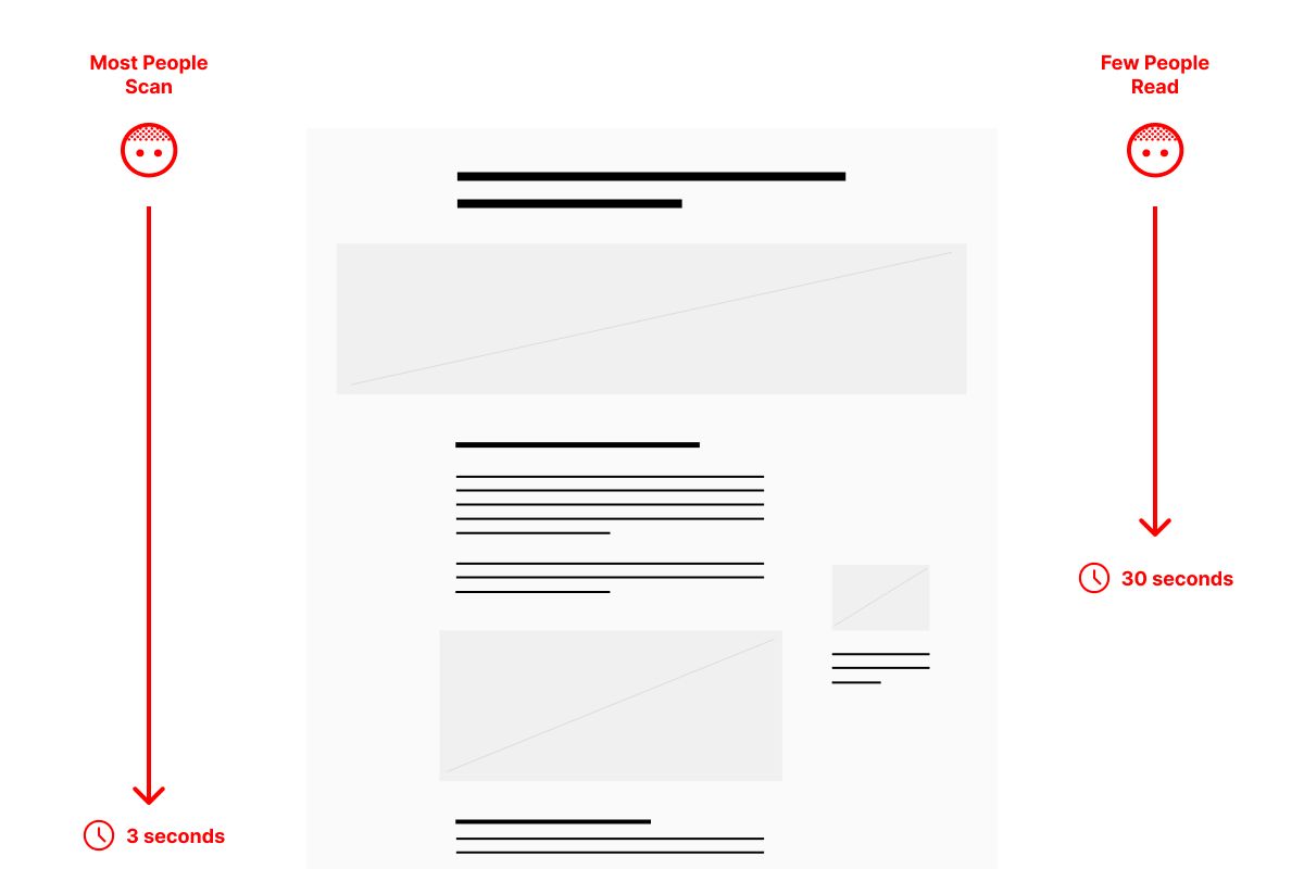
The average person is capable of reading 250 words per minute.

When I advise that a webpage — like a service detail page — have a maximum main body word-count of 150 words, I’m really recommending that it ask a reader to commit to 30 seconds. To put that in perspective, a 1,500 word article — the type of thing we’ve historically written with SEO in mind — could take ~6-10 minutes to read. Fewer and fewer people are doing that, even though search engine algorithms reward length.
As I said, the average person is capable of reading 250 words per minute; few people choose to do so. If you get nothing else from this post, let it be that.
This is why structuring a page for people who only scan it is so critical.
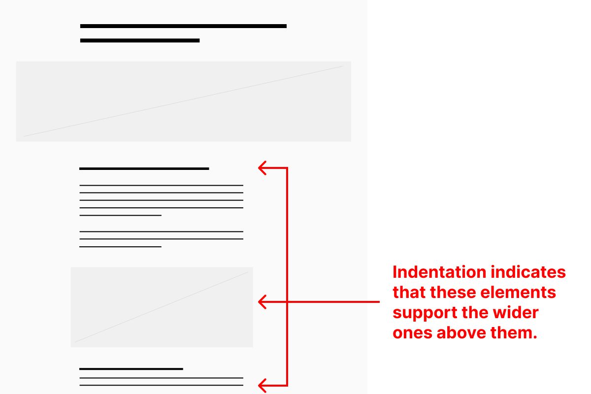
Recently, I wrote that Outlines are Information Architecture. I emphasized how important it is for people to be able to rapidly and accurately scan the contents of your pages. The indent/outdent structure of an outline helps a scanner understand both the content and its meta-content.
Scanning is How We Process Content and Meta-Content
The subject of a paragraph is its content; its meta-content is its relationship to other paragraphs, headlines, etc. For example, the subject of the paragraph you’re reading now is differentiating between content and meta-content. The headline above this paragraph coupled with the paragraph as a visual object create the meta-content, or, the “parent/child” relationship between the the two.
Headlines are Scanned, Paragraphs are Read
A scan of a headline structure makes both content and meta-content clear. It defines the contents following it, and visually demonstrates how it relates (e.g. summarizes) to whatever paragraph(s) or text sit beneath it.
A thoughtful arrangement of information on a page will help scanners apprehend its subject and intent extremely quickly, and can be easily applied to visual conventions you might use to lay out a page.
Arrange Your Visual Elements Like Text in an Outline
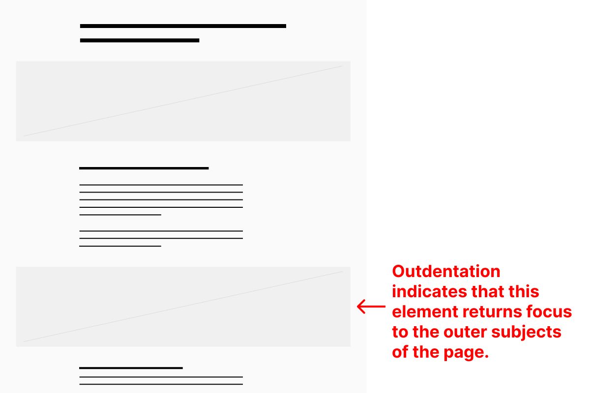
An element that is wider than the ones that follow it in a vertically oriented structure will operate like a headline in a text outline. An element that visually spans the full width of a page — like a “full bleed hero image” or “full bleed row” signals to the scanner a full “outdent” to the top-level of a page’s content.

When a scanner sees a full-bleed element in the midst of a narrower text column, for example, it’s almost like returning to the page’s header. It signals that this element is not a supporting element of the one it follows, but related to the overall page in general. That may or may not be true.

Typically, though, designers who use full-bleed elements don’t intend to communicate a “back to the top” or “full outdent” message — they’re really just trying to include something exciting, signal its importance, or do justice to a particularly special element or image. That can be done, of course, without confusing a scanner with a truly full-bleed visual span.
When considering the way a text outline operates and applying that to your page’s information architecture, even the subtlest indentations and outdentations are extremely effective in guiding a scanner’s understanding of the page.
Design for Active Audiences and the Ambiently Aware
Remember, 80% of your page’s visitors will not read it. Ever. 20% — at most — will. That doesn’t mean that 100% of your effort serves only 20% of your audience. It means that 80% of your audience can be considered active, while 20% of your audience should be considered ambiently aware. But 100% of your effort must go to serving 100% of your audience.
Here’s a very simple example: Typically, headlines for a case study tend to follow both the conceptual structure of (1) Problem, (2) Solution, (3) Results and are literally written that way. But putting the headline Problem above a paragraph only labels it. It presumes that a scanner will read the text that follows. But since we know that the majority of scanners will not do this, re-writing the headline to summarize the paragraph’s content is the right thing to do. “Solution,” for instance, becomes “Reduced Time to Market by 60%.” This small copywriting effort serves 100% of your audience.
Visual Language Must Always Serve Structure
Once you begin to see your page’s structure underneath its visual language, then you will find many opportunities to adjust it to better signal to scanners what it contains, whether it is relevant to them, and what they should do next.
Christopher Butler, May 5, 2023
Filed under: Essays