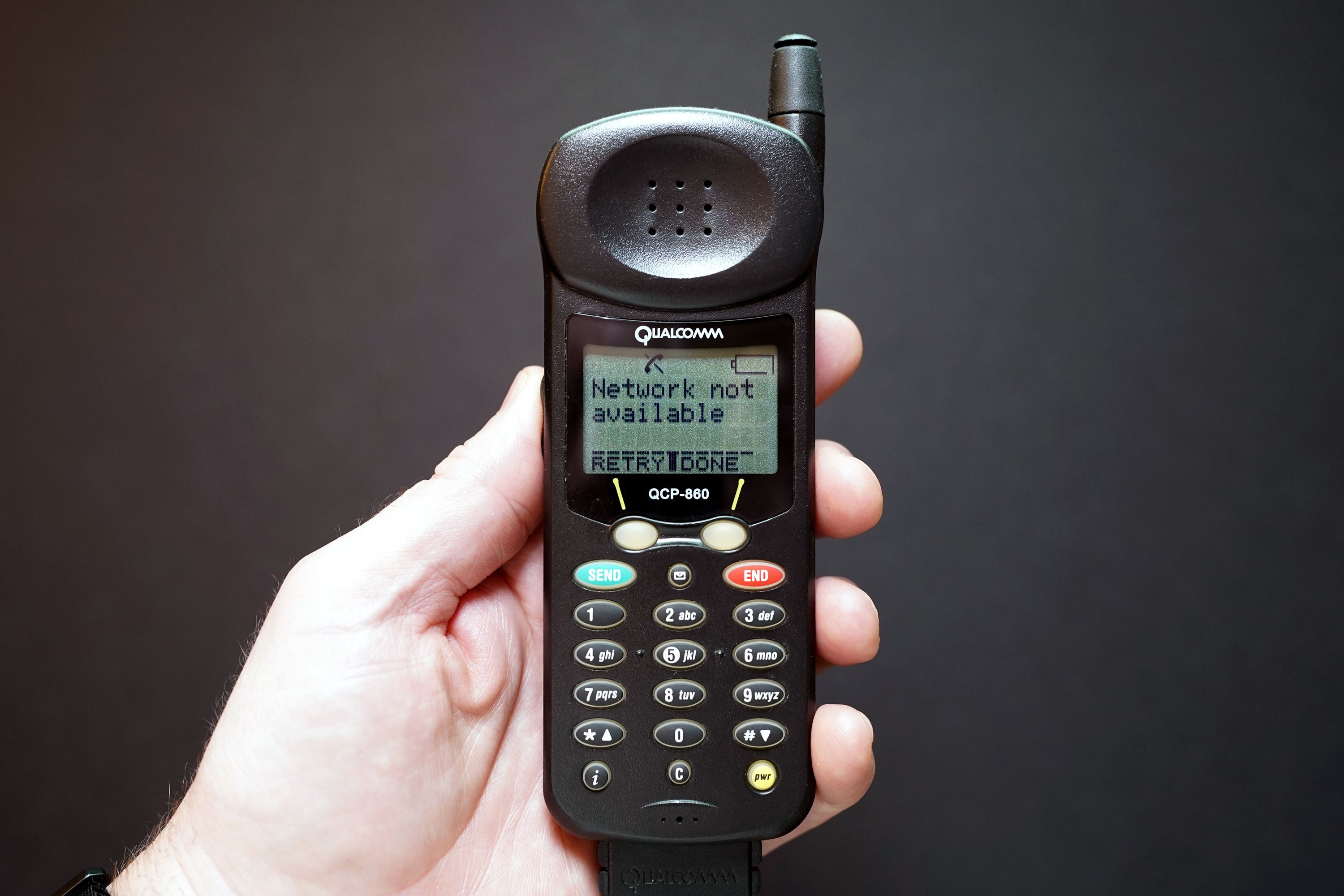
object — 1999 Qualcomm QCP-860
This is the phone I carried in my pocket when I went to see The Matrix.

My first cellphone was the Qualcomm QCP-860. It was marketed at the time as a “thin phone.” By today’s standards, that might seem silly, but at the time, phones were generally much chunkier. Like this Nokia, or this Siemens or this Philips. And to be fair, it’s actually not that much thicker than my iPhone 13 mini, a device made nearly 25 years later.
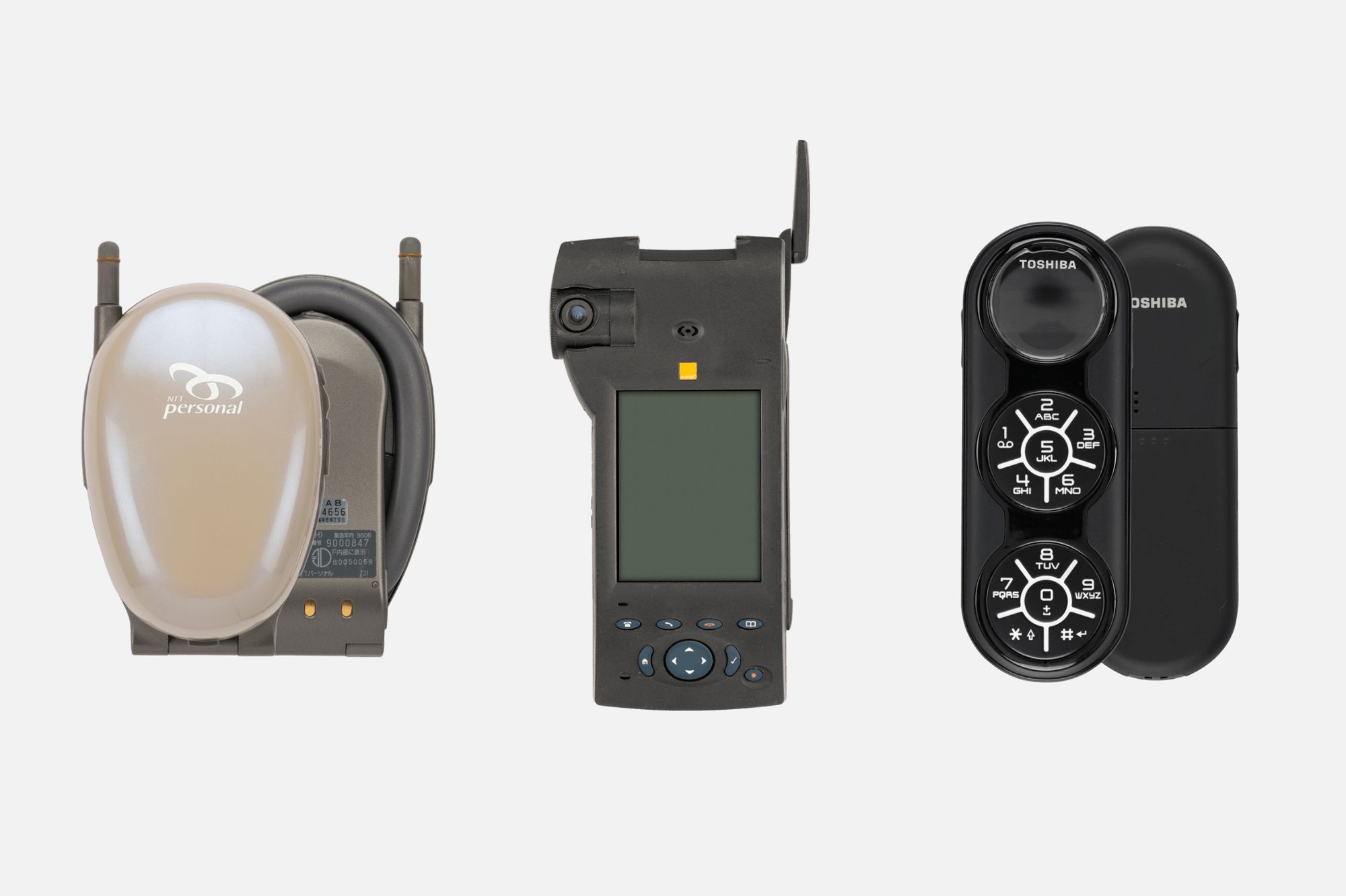
By the way, may I commend to you the Internet’s Mobile Phone Museum? It’s a beautiful catalog of hundreds (if not thousands) of mobile phones. There were some truly weirdo phones back in the day. You should look at them and marvel!

But back to The Matrix. Before he red-pills out, Mr. Anderson gets a call on his sleek Nokia 8110, which, for the time, was objectively cool looking and even more objectively cool feeling because of the way the bottom slid out over the keypad when making a call. It became iconic enough for Nokia to make a 4G version. It is absolutely the phone I’d prefer to use today if texting on it wasn’t the way texting was in the early 2000s.
Anyway, I, waiting in line with my friends to buy a ticket to see a movie that no one cared about yet, had a much more pedestrian phone in my pocket. But when I emerged a couple of hours later, I felt like it was at least 300% more sci-fi and cool.

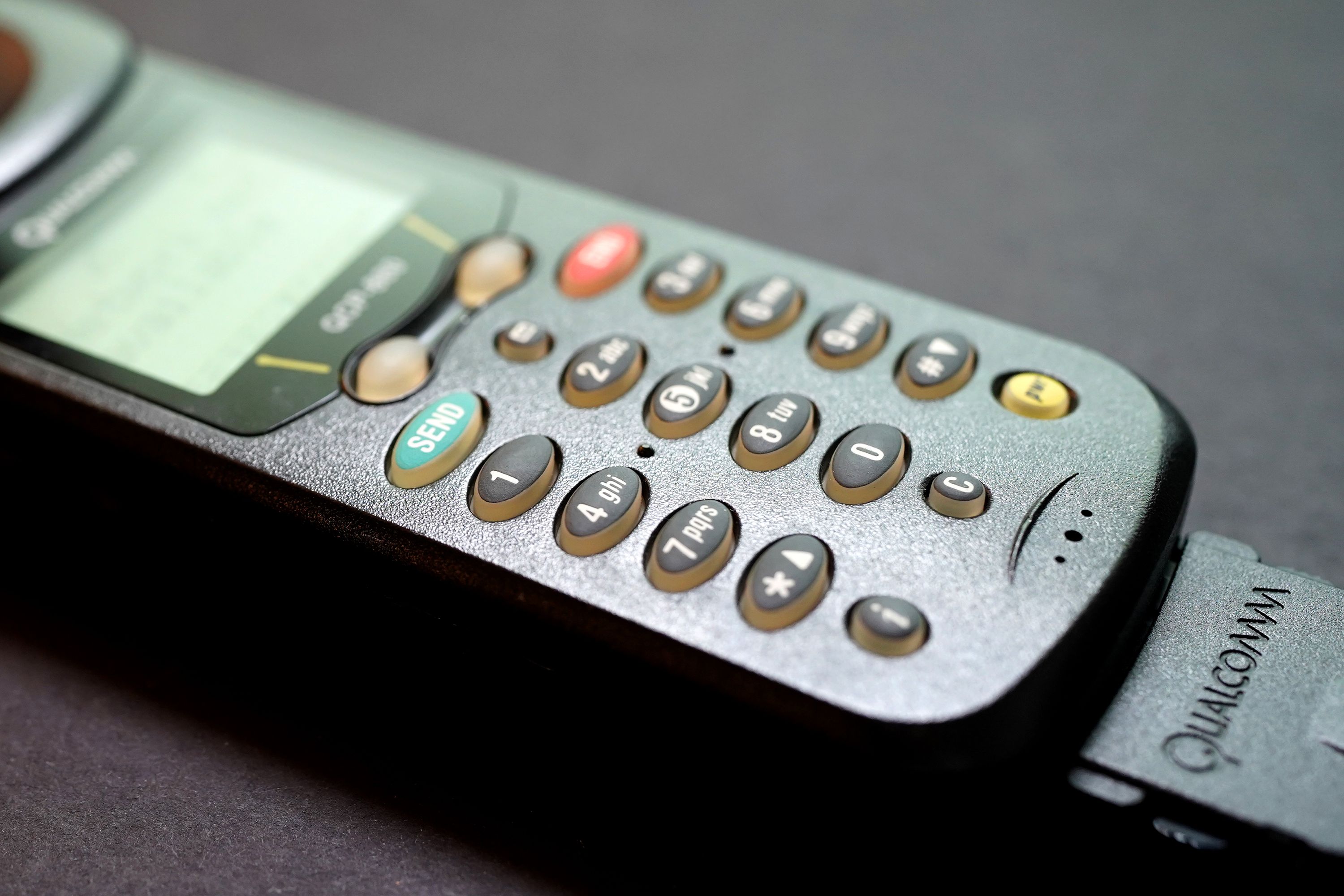
I still have it. And look — it has held up! The buttons feel great. The screen is sharp. The surface texture of the plastic body is grippy and satisfying.
When I look at it and hold it in my hand, I deeply wish that contemporary devices retained some of the object quality of things from the 90s. Not because of nostalgia, mind you, but because as beautiful as a slab of glass is, it is just much harder to hold! We’re all doing weird things to our hand skeletons because of how we’ve learned to hold phones that really want to slip away. Anyone with an iPhone that uses the tragic double-click Apple Pay feature knows what I’m talking about. On second thought, anyone that’s ever taken a photo with their phone knows what I’m talking about. A physical button (yes I know you can assign this to the iPhone’s buttons) that was designed to take a picture and only take a picture would allow for a much more ergonomically secure grip. But also, I could throw this Qualcomm across the room and it would not matter at all. Who would dare with my iPhone.
The Hard Part
I’ve written a bunch of things about phones:
chrbutler.com/search?q=cellphone
A running theme across these entries is how the product upgrade cycle creates an astonishing amount of waste. Millions of phones like this Qualcomm have accumulated in landfills over the last 25 years, not because they were incapably of physically enduring the years, but because corporations had an economic incentive to sell us newer, “better” devices. And look, I’m not going to say that a 1999 cellphone is “better” than a 2023 smartphone. But I think that the abrupt smackdown the market has leveled upon every single attempt to create modular device systems speaks for itself.
I do struggle, as a designer, with the basic fascination I have in looking at devices like this and thinking about materials and how they create unique experiences. It triggers a desire to create. That’s why any designer working on any project to create any new — though unnecessary — device would be understandably enthusiastic about the task. When I flip through all the images in the Mobile Phone Museum linked-to above, I get excited. The things look cool! I want to hold them! I want to press their buttons and hear their bleeps and chimes. I want to put them in my pocket. But then I think about the aggregate cost of that — the fields of perpetually burning e-waste that are the reckoning of the creative spirit + capitalism. It makes me sad that striking a manageable balance is now impossible because of the accumulated, destructive weight of one side over the other.
Written by Christopher Butler on
Tagged